Website design - Apex Services - Epping

Apex Services – Website Design

Website designed for Apex Services - specialists in block maintenance and property renovations. Brochure website is designed to showcase the services provided. Includes project Gallery page. The website was designed for WordPress. This project also included a brand-new logo. Click link below to view live site: https://apexservices.biz/...

0
Apex Services - logo - by Creationz

Apex Services – Logo design

Project included logo design, and a brand-new website design to showcase the services offered. Although the client did have a logo design, after doing some research, we discovered that the logo was almost identical to a number of other companies and was therefore not suitable to take this new exciting company into its future. Changing their logo design at the early stages is ideal on many levels, and far less costly in the long-term too. View website live website design: https://apexservices.biz/ ...

0
Q&A Coaching - Booking area

Q&A Coaching – Website design & branding

A new brand and website design with online booking system was created for Michael Crawford - Q&A Coaching. Q&A provide career, life, and relationship coaching. The task was to create a strong brand that was approachable and professional. The website featured; service pages, client testimonials, FAQ's and more. The key area website was the booking system that needed to integrate seamlessly with Michael's active diary. A logo, stationary and branding document was also created. View live site here: https://qandacoaching.uk/...

0
Gary Thomas KYPA - Website desiggn

Gary Thomas KYPA – Website Design

New website design created for Gary Thomas KYPA - Teacher / Photographer / Project Manager. Gary has done some great work with young people and has worked with an extensive list of A-List celebrities. The trick was to showcase the core services provided, and a good cross-section from the hugely diverse body of work whilst keeping concise and focused. The website includes service pages, project galleries, testimonials and more. Key features: Videography A series of videos was filmed to help explain the core components of their KYPA youth programme. We also filmed a series of testimonials from the successful participants reflecting on the programme 20yrs on. Live Instagram feed The website features an Updates section where Gary's Instagram posts are streamed directly into the site. This was ideal, as it enabled the site to remain current without needing to log in to the website.  ...

0
Woodford TTS website

Woodford TTS Website Design

Website design for Woodford Table Tennis School. We created a brand new website for this client. We transformed an outdated static website into a website that reflected the dynamism of the school. We achieved this by creating a fresh new design, making it work responsively on mobile devices as well as desktop computers. We created and streamed video content in various areas within the site, and helped restructure content. Work also included SEO and logo design. To view logo click here. Key features: Event booking Pupils are able to see all events that are happening via a calendar, book classes, and reserve tables online. Payments are taken via Paypal. Videography We also assist with video work which was used within the site as well us promotional video material used for marketing purposes on social media. ...

1
Woodford TTS logo

Woodford TTS logo

This logo design was created for Woodford Table Tennis School. We wanted to create something simple and professional. The objective was ultimately to create a logo that worked a bit like a sports brand, but also reflected the energy of the sport. The yellow shape represents the energetic path of the ball and the initial Z from the founder Zoltan Hosszu. We also created a brand new website as well as promotional video content to raise awareness and funding objectives....

0
Barnet Nannies logo

Barnet Nannies Logo

Logo redesign for Barnet Nannies agency. We devised a solution that was simple to understand and set them apart from their competitors. We were able to create something totally new for them, but by sticking to a similar theme and colour palette provided a degree of transition that their existing customer base could identify with....

0
Barnet Nannies website portfolio screenshot

Barnet Nannies

New responsive website designed for Barnet Nannies. The client needed their old site to be totally redesigned including their logo. Though this was a total redesign if you will excuse the pun, we didn't want to 'throw the baby out with the bathwater', utilised much of the existing content with minimal edits and a little restructuring. Similarly, we kept to a similar colour palette as the previous site and continued with the illustrative approach as we felt this made the site more approachable and set them apart from their competitors. The new site is more modern, lighter fresher with new illustrations that work well together. You can view the live site at: barnetnannies.co.uk...

1
IZ High Performance logo

Logo design – IZ High Performance

This logo was created for IZ High performance, an new health and fitness company based in Australia. The letters IZ were used as it is an abbreviation of the clients own name. Perfectly placed within, is a pyramid - a symbol of strength, longevity and wisdom. The symbol was then framed within a circle representing holistics. ...

1
www.kimbacchus.com website screen shot

KBS – Website Design

This website, logo and branding solution was designed for Kim Bacchus - Life Coach, domestic violence survivor and Author of 3 bestselling books. This solution needed to be professional, user-friendly, and convey a strong and distinct brand. The logo features a rainbow - a common symbol of hope, set on a black background, which pretty much sums up what they are about. The brand was translated to business cards, letterheads, logo, and website. The website was designed responsively so that mobile devise users could access the website with uncompromising ease. "It is great when as a designer, you get to do your job and know that you are helping positive people such as Kim Bacchus reach out more effectively and touch the lives of others" Arhon Ankhkara - Creationz....

1
Course boolet image

Booklet – Benson & Company

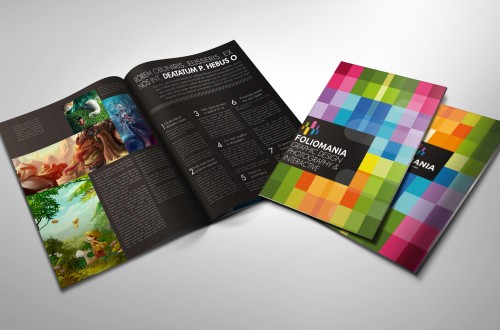
For Benson & Company, we helped develop and hone their unique brand. This is a training booklet which showcases a selection of their vast array of courses provided to companies internationally. This distinctive brand dares to be black and white, both in its ethos and is visual manifestation. This approach is very brave, as the temptation to use colour has great. Therefore, sticking to the core principles the brand, has resulted in something very unique. For Benson & Company we have also created a strong direct mail campaign, stationary, brochures with more to come, so watch this space. Find out how we can help you today Email us or give us a call on: 0794 1100663: Contact Us ...

5

Redefining Sanity Conference

This brochure, designed for a range of national conferences, held in London, Liverpool and Manchester - organized by In-volve and Banardo's to promote solutions to mental ill health and violence within Black and minority ethnic communities. This brochure formed part of a campaign of material which included; 6ft conference backdrop banners, created graphics were also used for film related material. Creationz was also responsible for the design and implementation of their and online booking system. To give each conference unified but distinct identities each regional event was printed in different colours. Find out how we can help you today Email us or give us a call on: 0794 1100663: Contact Us ...

4
Billboard design

Campaigns

This billboard campaign designed in response to HIV and AIDS, was created in 1995 at a time when there was a lot of stigma and confusion around what could and still can only be described as an epidemic crises. Therefore a clean and memorable concept was deployed. The idea of the ‘Lifesaver” and the image of a condom were combined to form a simple but powerful message. Over a decade later the use of condoms still remains the most effective method of preventing the spread of this viral menace. This billboard also exhibited at the Royal College of Art, where he obtained his Masters Degree in Graphic Design and Art Direction. Find out how we can help you today Email us or give...

9

RAW – Logo design

This design was created for the RAW Projected . This logo design has a contemporary feel, but takes its true inspiration from the profound hieroglyphic symbolic heritage of KEMET . The all-seeing eye was combined with the name of the project. "When this logo was created it was one of those moments when you feel this solution was just meant to be." Arhon Paul Ankhkara - MA (RCA). This logo has also been featured on related video footage, t-shirts, awareness material as well as stationary. Find out how we can help you today Email us or give us a call on: 0794 1100663: Contact Us ...

5
RSPB Advocacy Report 2007-8

RSPB Advocacy Report 2007- 8

This report, designed for RSPB was created as a full colour, dual language, flip-and-turn report . Great care was taken to ensure that editorial and visual consistency was maintained for both translations, and that their established brand guidelines were maintained whilst at the same time striving for a solution that was fresh and new. Find out how we can help you today Email us or give us a call on: 0794 1100663: Contact Us ...

3

Illustration

The above images, formed part of series of illustrations created for a range of promotional material also designed by Creationz. "There are times when photo library images just will not do". We felt that the promotional material created for this project needed to reflect the young people whom the project was aimed at. To achieve these images, Arhon Ankhkara took photos of young people on the project and used them as inspiration for these digitally hand drawn illustrations. Find out how we can help you today Email us or give us a call on: 0794 1100663: Contact Us ...

5
Love Abridged Logo

Logo – Love Abridged

Creationz created this new logo / brand identity for the exciting new mentoring program aimed at up and coming jazz Artists. For this project we wanted to create something that was stylish, classical and distinctive. This video, we feel exemplifies good brand continuity. Find out how we can help you today Email us or give us a call on: 0794 1100663: Contact Us ...

4
website homepage preview

Website design – BLD Foundation

This web solution was designed for The BLD Foundation. For this client we created the following: Find out how we can help you today Email us or give us a call on:

4

Illustration – TB Alert e-shot

For TB Alert, we took a fresh approach to compliment their 'outside-the-box' promotional campaign, entitled "Is Your Boss a drag". The campaign included a downloadable poster to recruit fundraisers, and an e-shot design to raise awareness of the event as well increasing corporate involvement. Find out how we can help you today Email us or give us a call on: 0794 1100663: Contact Us ...

5

Wemun – Logo design

This logo designed for Wemun embodies the concept of creativity and balance. For me there is no better symbol of creativity than the circle, the building blocks of all things. The inspiration for this logo was also drawn from the Yin & Yan one the most ancient symbols of universal balance. Designed some years ago, still remains one of my favorite logos, for its simplicity and elegance. Arhon Ankhkara Find out how we can help you today Email us or give us a call on: 0794 1100663: Contact Us ...

2
comfyearplugs.com design previews

Website design – comfyearplugs.com

Comfyearplugs.com came to Creationz because they had recently had their website redesigned by another designer and the sales had actually dropped. Creationz provided free consultation to decipher where the problems were and was able to help them, not only produce a superior looking site, but also increase there sales performance. In this case, part of the problem was the design, but the overriding issues resided in the poor functioning of the site. With this particular job we were able to demonstrate the importance of flawless functionality as well as good visual design. The SEO on the previous site was not really an issue, so it goes to show customer's faith in a good product can be hindered by poor design and execution. Find out how we can help you today

2
New beginnings website design

Website design – newbeginningscounselling.co.uk

This website was designed and built for the Joomla CMS, and provided the perfect 'beginning' for the clients newly formed company. For this project we helped develop the brand as well as the website. The integration of high caliber imagery helped communicate the concept whist also showing off the beauty of the surrounding area from which this counselling service was based. Features included: Find out how we can help you today Email us or give us a call on: 0794 1100663: [button class="mpc-button-1" background="#2FADA2"...

3

Website design – Benson & Company

This 'site under construction' page was created for Benson & Co. For this page we wanted to offer a little more than your standard under construction page, For this site, we also provided  the viewer with the option to receive news updates as well as being informed the moment the site become live, which we felt was more useful than simply telling the viewer that the site was not ready yet. Visitors were also able do download a PDF Brochure as well as other pertinent content. Creationz were also responsible for the design of their downloadable brochures and training material as well as brand development. Find out how we can help you today Email us or give us a call on: 0794 1100663: Contact...

2
Annual report portfolio sample

Annual Report – NDAP

For this annual report we wanted to create solution that embraced islamic culture to reflect the organizations commitment to diversity. As with islamic art many of the graphics were based on circles. Rather than your bog standard obligatory statistical graph inclusions, we decided to make each graph a decorative feature throughout the document - providing descriptive visuals that would draw the reader in with a level of intrigue. The cover was screen printed with green ink on black paper, giving it a subtly unique quality and feel. Printing the cover on black paper also meant the spine and the edges would not crack or chip over time and reveal what would usually be white paper underneath. The inside pages were printed on pastel green, slightly textured recycled paper - good for the environment and gorgeous on the eye. The colour in the paper also meant that we could print...

6
Website homepage

Website design – HREC

Website designed recently for the Human Rights And Equality Consultancy. This website was designed and built for the Joomla CMS. It includes a host of features such as responsive functionality(ie. automatically reconfigures design to suit viewing device) membership, news, blogs, search queries, easy to manage backend content, specially created accessibility toolbar, and much more. View Testimonial Find out how we can help you today Email us or give us a call on: 0794 1100663: Contact Us ...

1

Literature

This handbook was designed for NDAP (now known as In-volve). For this project a fresh approach to drug related material was taken. Concepts devised, combined innocence with a slightly sinister and thought provoking twist. As well as creating the design and illustrations, a series of specially adapted nursery rhymes were created and punctuated throughout the document. Find out how we can help you today Email us or give us a call on: 0794 1100663: Contact Us ...

5
Boys face

Photography

This photograph was originally taken as part of a series of images for the London Borough of Merton to be featured in a PSE teacher training booklet. The inspiration for this series of images was 'personality, and diversity'. On this shoot I simply got a class of young children to sit in front of the camera one by one, the only instructions I gave was that they would have two pictures taken each, In one they should smile and the other I wanted them to pull a funny face. Each child did something different, but as each person took their turn the task somehow become more challenging and creative. That is how this image was conceived. The fascinating thing is that without this knowledge, this image, depending on context could be interpreted in an almost infinite number of ways. And a result, has become my most used...

9
fireproofers.uk

Fireproofers.uk web design

Content coming soon. This site was designed for Fireproofers.uk, a UK based fire proofing company. The site was developed for the Joomla 3 CMS....

0
Portrait of Nelson Mandela

Mandela Portrait

Portrait created as a tribute to a truly exceptional man. An angel in our midst. Thank you Mandela, you inspired me and the whole world, you lifted the lid on what can be achieved. This portrait was created using a digital pen and virtual paint. Find out how we can help you today Email us or give us a call on: 0794 1100663: Contact Us ...

3
load more